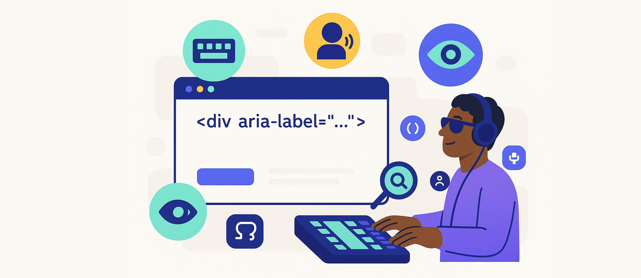
What Is an ARIA Label?
An ARIA label is an HTML attribute that provides invisible text for screen readers to interpret an element’s purpose. It’s part of WAI-ARIA (Web Accessibility Initiative – Accessible Rich Internet Applications) and is intended to supplement semantic HTML, not replace it.
Too often, ARIA is used incorrectly, causing more harm than good — hiding content, duplicating information, or making elements unusable for assistive tech users. ARIA labels are powerful, but with power comes responsibility.
When to Use ARIA Labels (With Examples)
ARIA labels should only be used when:
✅ Example: Close Button with No Text:
<button aria-label="Close menu">
  <svg role="img" aria-hidden="true">...</svg>
</button>
This is a valid use of aria-label, where there is no visible text and users need a clear description of the button’s action.
When Not to Use ARIA Labels
According to accessibility experts, misusing ARIA is worse than not using it at all.
Avoid aria-label when:
❌ Misuse Example (Redundant Labeling)
<button aria-label="Download">Download</button>
This results in a screen reader saying “Download Download” — confusing and unnecessary.
✅ Fix: Use the visible text only
<button>Download</button>
Common ARIA Mistakes That Hurt Accessibility
Prefer Semantic HTML First
Before using ARIA, ask:
Can this be done with standard HTML?
If yes, use that instead. Semantic HTML is:
- Natively supported by all browsers
- Recognized by screen readers
- Easier to maintain and style
🔍 Example: Instead of using a div with aria-label="Submit", use a native <button> with text content.
Use aria-labelledby Instead When Referencing Visible Text
<h2 id="account">Account Settings</h2>
<div role="region" aria-labelledby="account">...</div>
Final Thoughts
ARIA labels are not a fix-all. In fact, overusing or misusing them can make your site less accessible, not more. Use them only when necessary, and always prioritize semantic, native HTML elements.
When implemented properly, ARIA attributes like aria-label can support inclusive design — but when done poorly, they confuse, duplicate, or outright hide critical information.
👉 At inklu, we build with accessibility-first principles — including smart defaults that prevent ARIA misuse. Our platform helps you create inclusive digital experiences that are usable, navigable, and SEO-optimized out of the box.
Want to Build with Better Accessibility?
Get started with inklu.app and ensure your content is not only accessible — but done right.